INTUNE
Year
2026
Service Provided
Brand Identity
THE BRAND
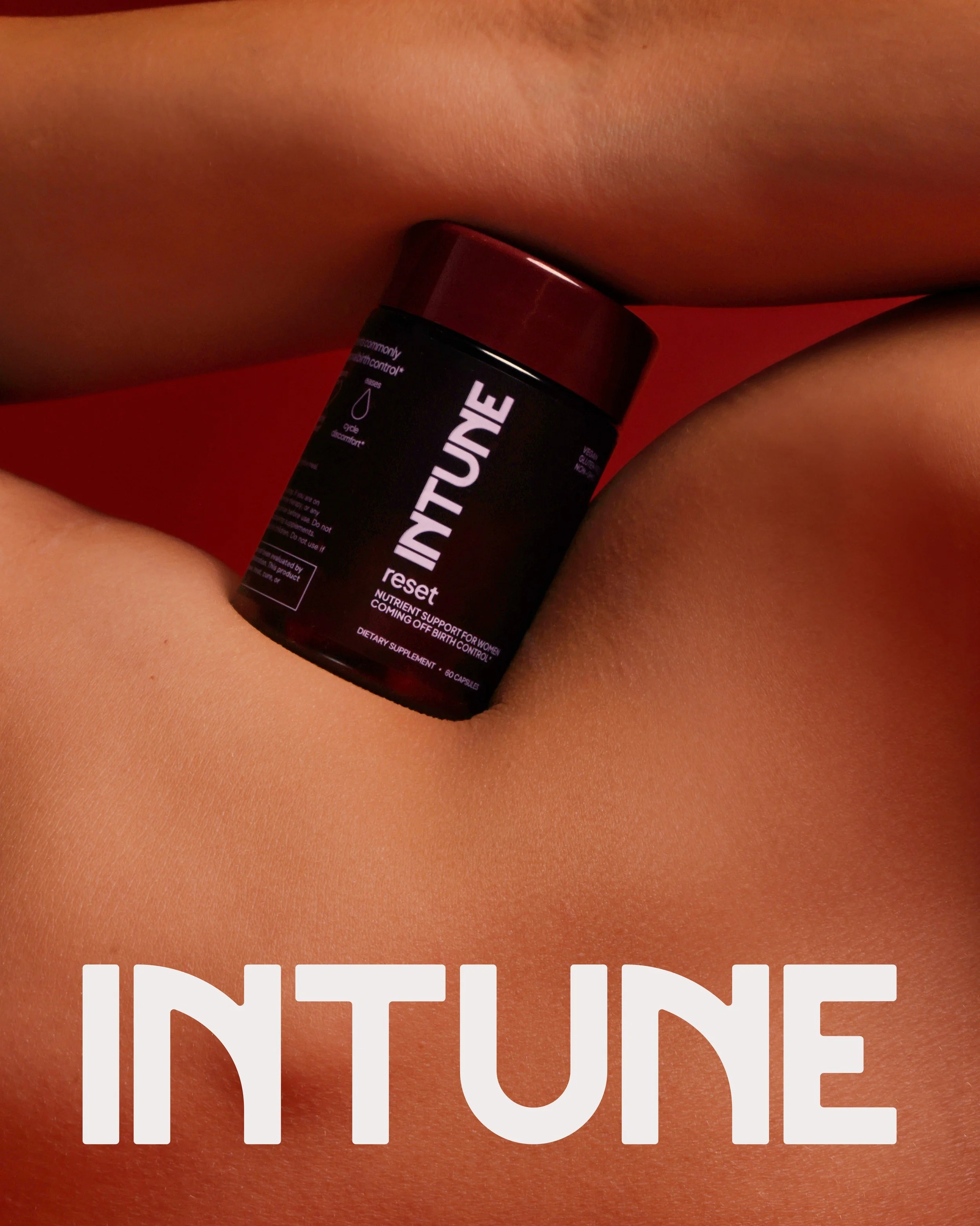
Intune is a women’s supplement brand built for life after hormonal birth control. Intune treats the menstrual cycle as something to understand rather than suppress, and pairs its formulations with clear, honest education.
THE BREIF
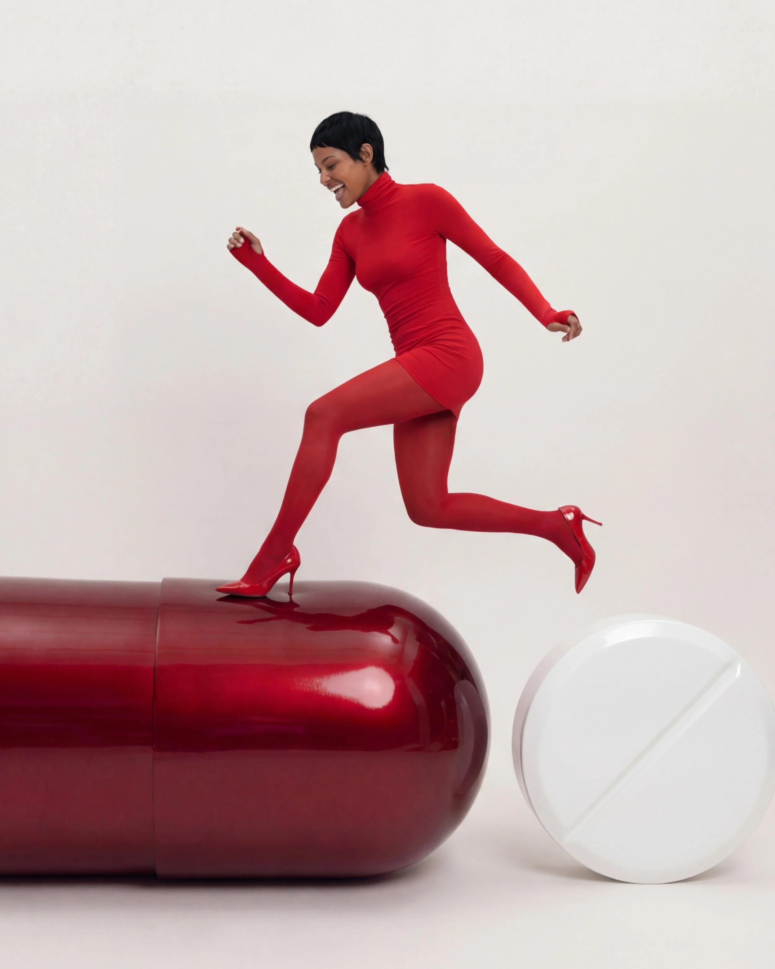
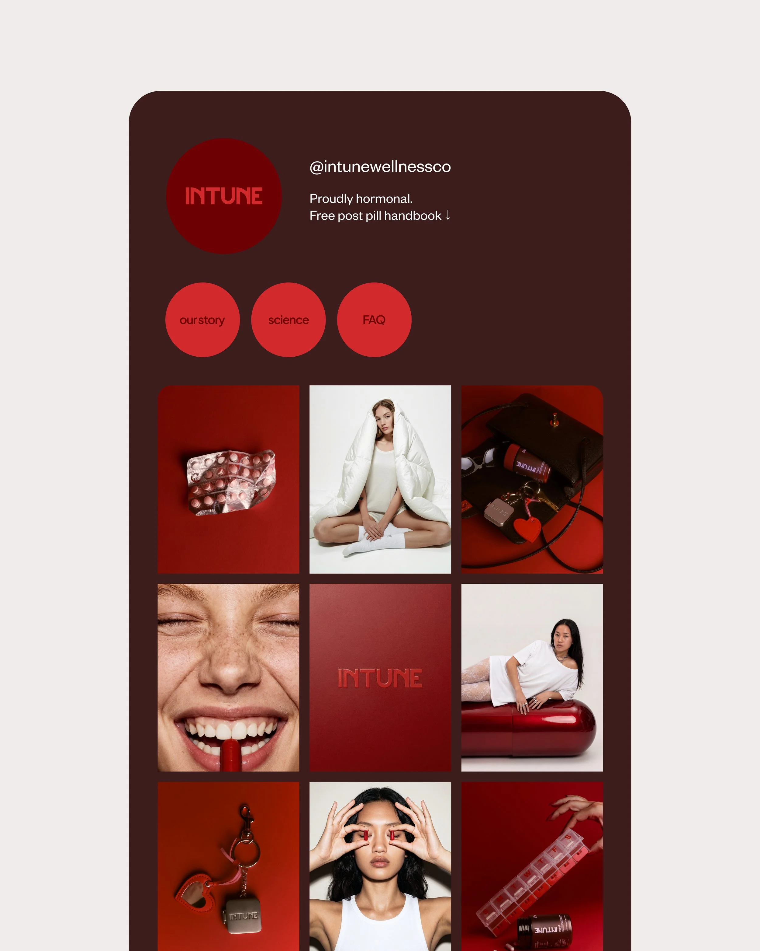
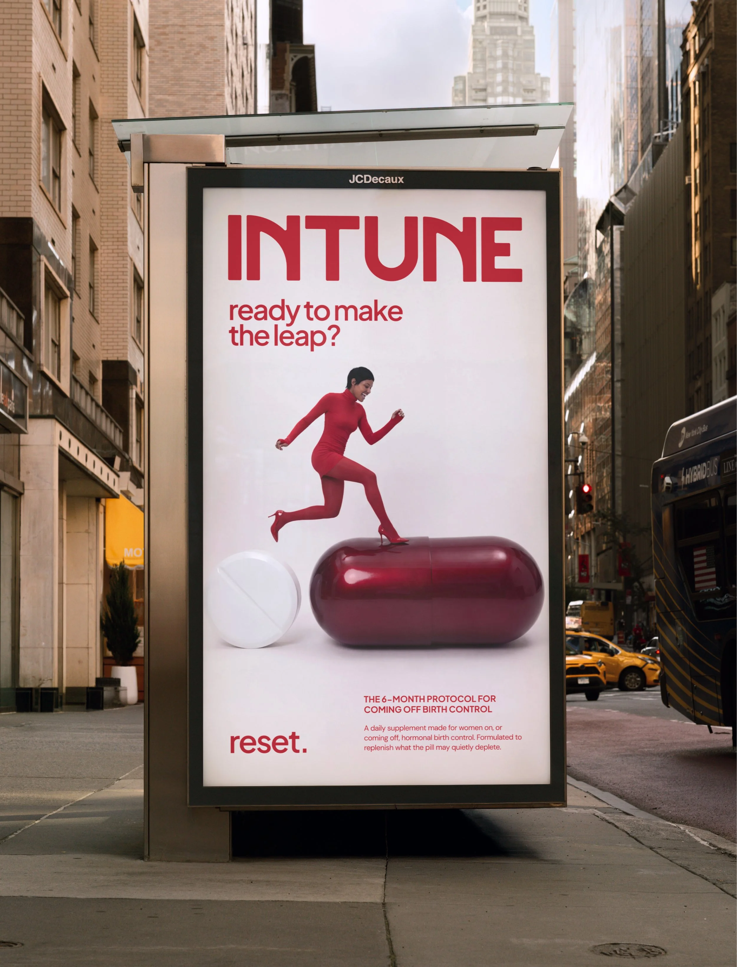
A Gen Z founder entering one of the most saturated categories in wellness. Sophie was clear that Intune shouldn’t look like its competitors, the brand needed boldness and personality, while staying scientific and credible enough to earn trust in women’s health. It also had to challenge big birth control head-on and speak to an audience that is informed and rightly sceptical.
OUR APPROACH
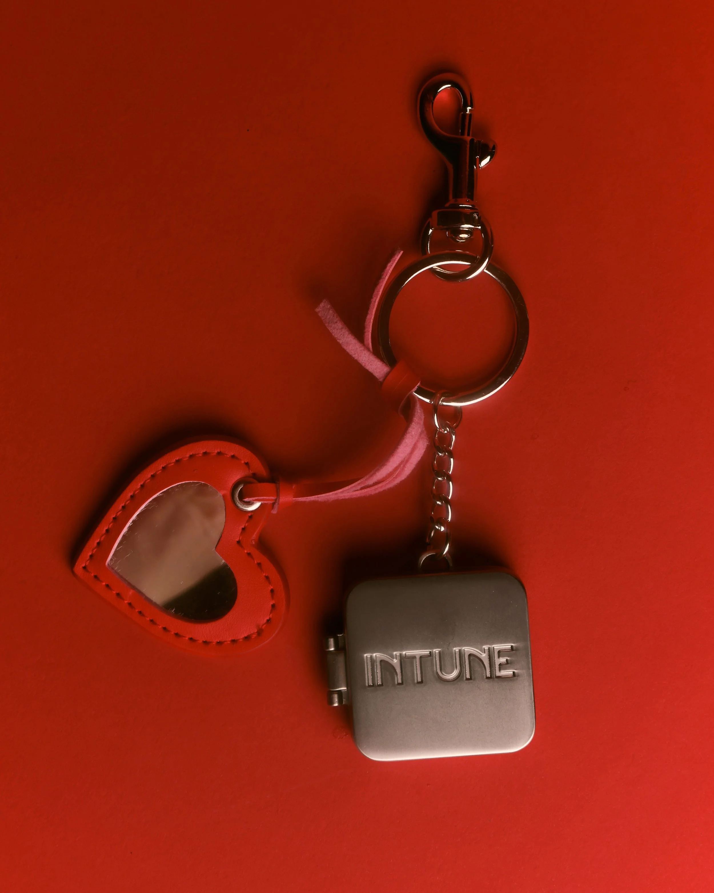
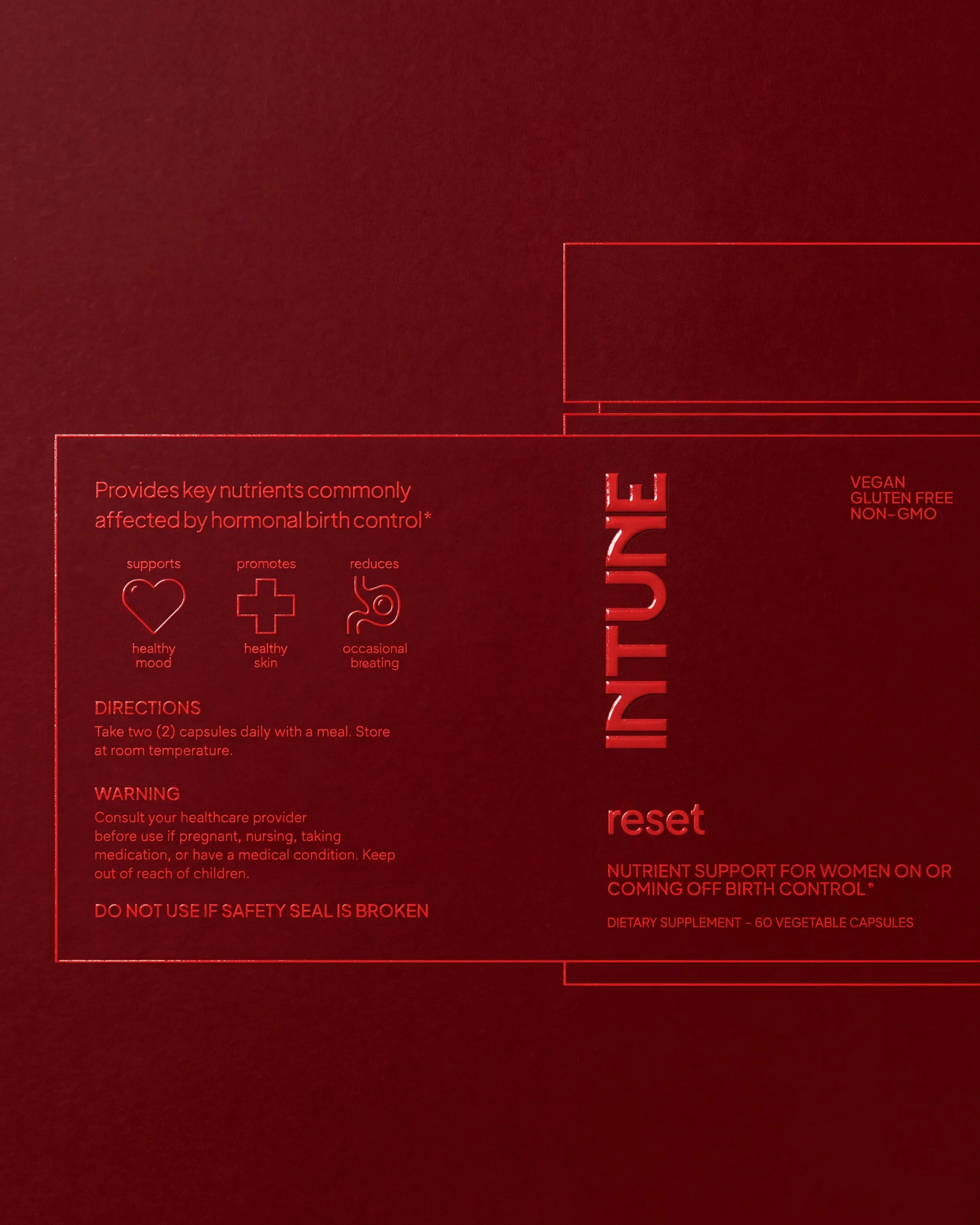
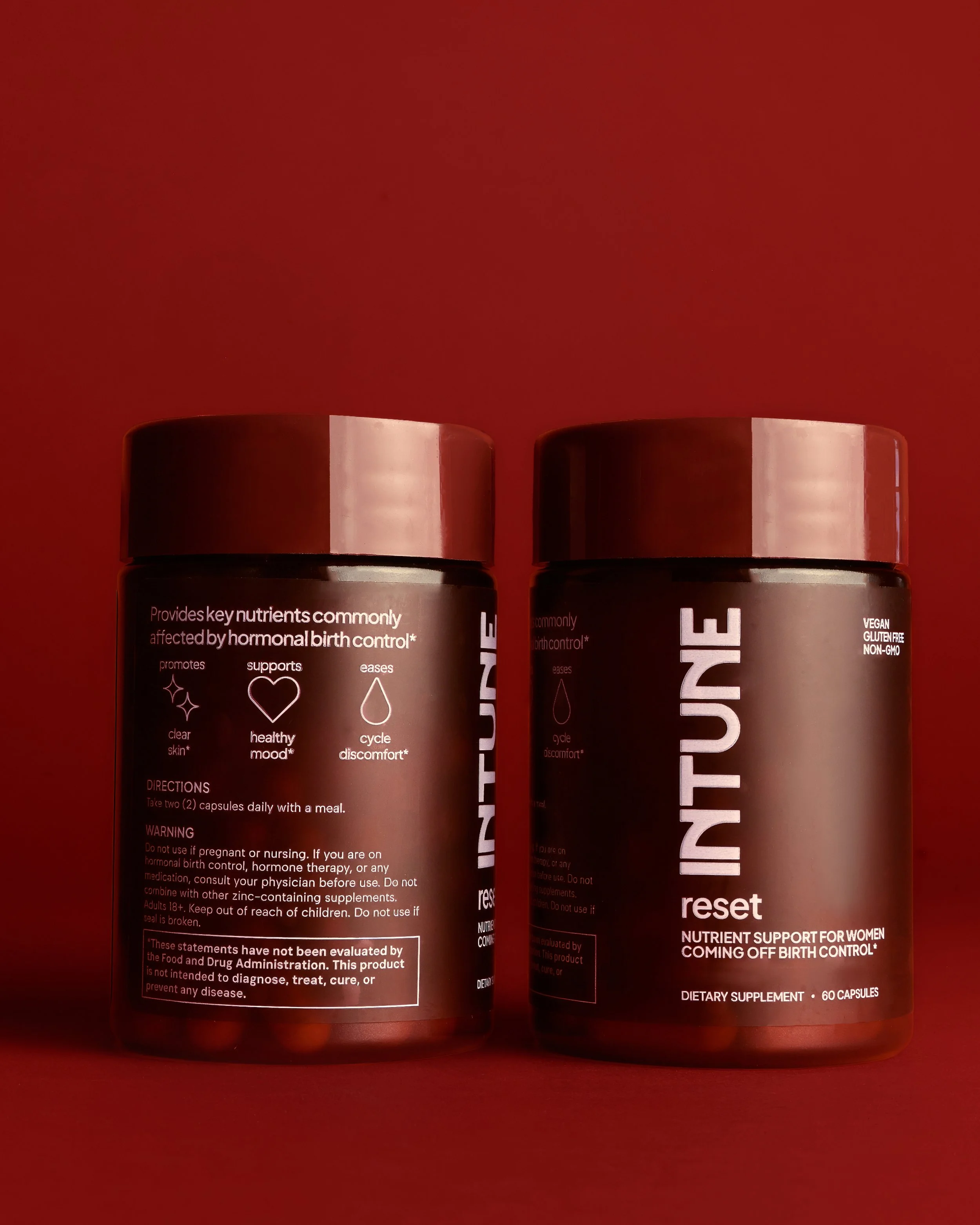
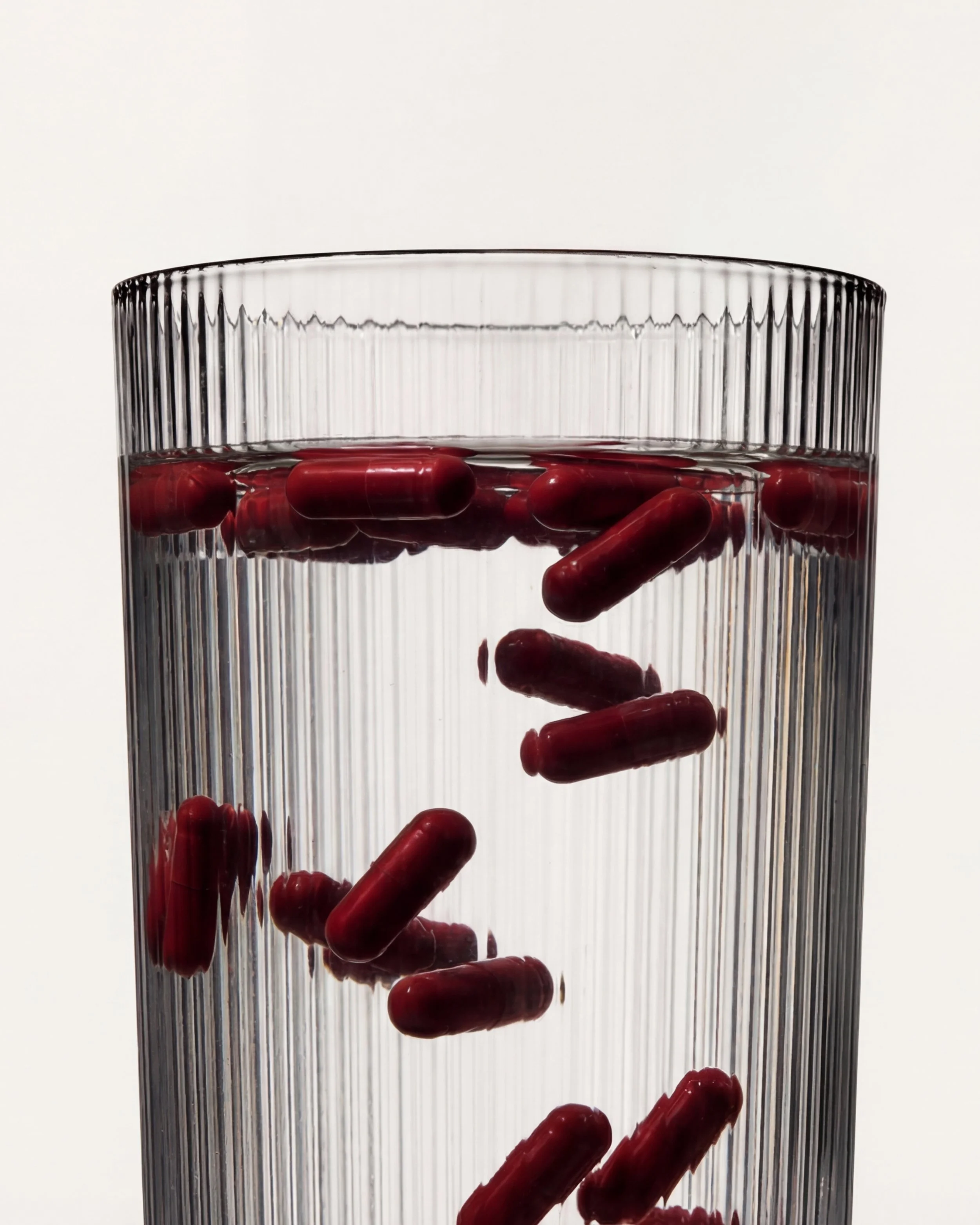
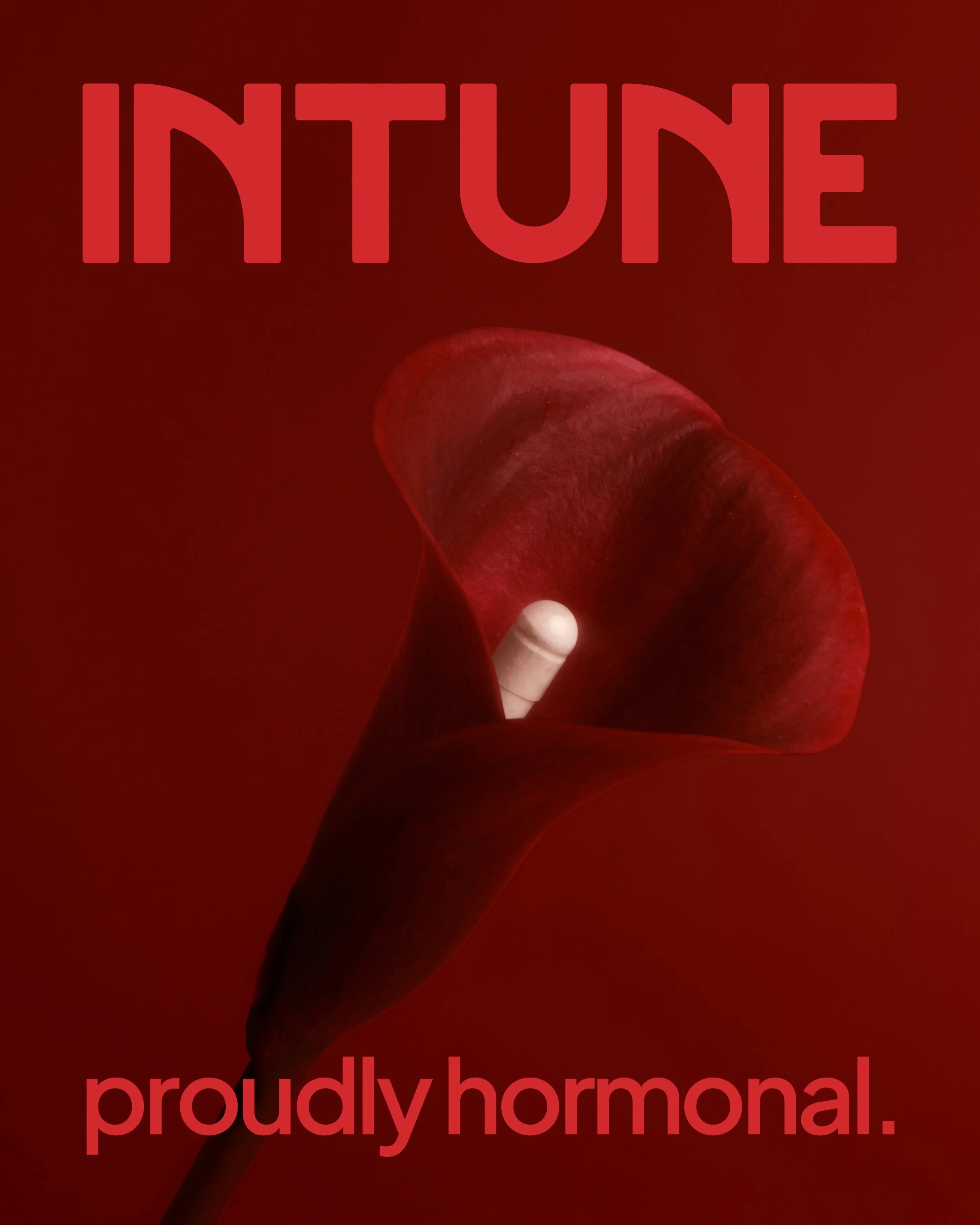
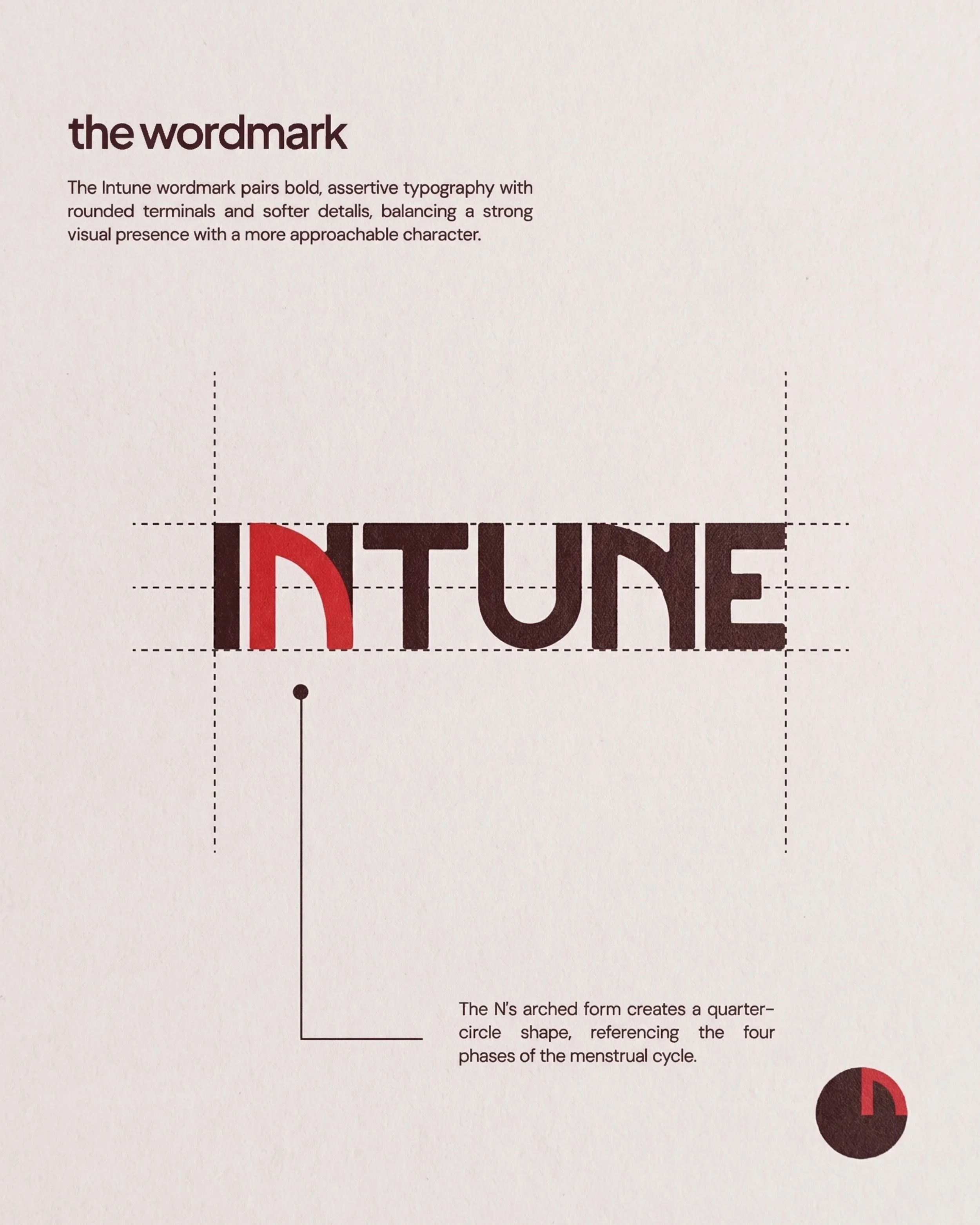
We started by asking what a women’s health brand looks like when it stops apologising for the body. Intune puts the colour of menstruation at the centre of the identity. The palette is unmistakable on shelf and deliberately at odds with the category. We balanced that energy with a clear, structured system across the Reset packaging and website, so the science always reads as seriously as the attitude.
THE RESULTS
“Versed Visual were instrumental in bringing my vision for Intune to life. They really took the time to understand what I was trying to create, and I was honestly shook by how well they captured it, even in the very first round of designs.
As a first-time supplement founder, there was so much I was figuring out along the way, from what was even feasible with packaging to going through countless iterations of the website. They were incredibly patient with me throughout the entire process and always willing to work through the smallest details until everything felt right.
I’m so grateful to have worked with them and genuinely couldn’t be happier with how everything turned out!”
— Sophie, Founder of Intune